Menu

Brand Centre

Be inspired by a story we have already been writing together for 30 years. Dive in and get to know the character and face of the BioVendor Group brand.  

Concise and easy-to-understand rules will make it easier for you to create our common narrative.

#01
Fascination with discovering

We are curious. And we understand diagnostics.

The road to great innovations is lined with dead ends. Discovering these is also part of our work – because at each dead end we are always one possibility closer to real change.

The freedom to look for ways to achieve more reliable and faster diagnostics makes us the technological leader in the field.

Quality diagnostics, which help in the treatment of patients, is our vision and the reason we return to work every day.

The road to innovation has no end.

#02
Our mission

We believe that quality, fast and reliable diagnosis is a prerequisite for successful treatment. Laboratories need user-friendly tools, physicians need reliable diagnostic data. People all over the world need the confidence of correctly determined treatment leading to successful recovery.

Laboratory technicians, physicians, patients.

Three groups of people whose needs are the focus of our interest.

Three reasons why we push the boundaries of current possibilities every day.

Our mission

#03
Company values

I.

Interest in people

Interest in people

Our products help treat patients, their design and customer support make the life of people in laboratories easier.  

We treat everyone inside and outside the company as a personality whose uniqueness is appreciated.

Because freedom of the individual is the breeding ground for innovation.

II.

Desire to discover

Desire to discover

Constantly searching for and overcoming challenges is the foundation of our success

and identity. We are scientists, and research is the essence of our work.

Determination, experience and know-how is our most valuable asset.

III.

Pride

Pride

Company, field, region – three things we are proud to endorse.

Knowing history helps us build a vision for a better future.

A future we are proud to help create.

#04
Bridging Science and Diagnostics

We pack scientific know-how into a box with instructions.

We use our know-how and technology to turn scientific discoveries into products that help make a diagnosis.

We guide scientists to address pressing needs.

We know what diagnostics need. Through grants, we bring scientific teams together to fill in the blank spots on the map.

We bring new parameters to established platforms

We develop and modify innovative parameters for use in modern diagnostic platforms.

#05
What language do we speak?

Determined

Breakthrough innovations lie beyond the explored areas. Moving them is a risky challenge which we at the BioVendor Group accept without hesitation.

Determination needn’t be communicated explicitly – it can be clearly seen from the description of the challenge behind the task.

EXAMPLE

"We present to you the miREIA kit – the result of two years of effort, experiments and dead ends."

"Three scientific teams, two years of joint work – this is miREIA, a new method for microRNA quantification."

Friendly

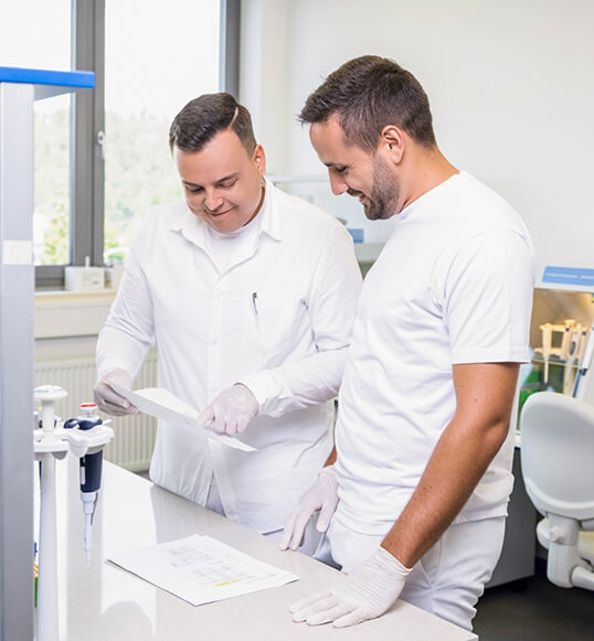
People are in the centre of our interest. Customers, partners, patients, employees – because of them we do our best.

Every product, service or innovation serves a certain group of people – it makes work easier for someone, helps with healing, and much more. This impact on people's lives is the basis of our narrative.

EXAMPLE

"We know that there is never enough space in laboratories. That is why we have slimmed our packaging by 20%. This saves space during transport, storage as well as on overflowing laboratory tables.”

“Waiting for negative results of COVID-19 PCR tests can take several sleepless nights. Thanks to the immunochromatographic test, you can be back at work in 8 minutes.”

Trustworthy/professional

We are scientists – and research is the essence of our work. It requires experience, endurance and know-how, which we appreciate in our people.  

Credibility needn’t to be proven by rigid expertise. Our messages reflect our character – we are experts, but we talk on a human level.

Proud

At the BioVendor Group, we work on things we can be justifiably proud of. Successes, failures as well as completely ordinary events of everyday life.

EXAMPLE

“Brno won the survey as the best university town in the Czech Republic. MUNI, VUT, MENDEL – thank you! ”

"The pursuit to fulfil ambitious visions carries the risk of failure. However, discovery of a dead end is also a part of life in an innovative company.”

#06
How are we looking?

Diagnostics is a discipline whose proper function definitely takes precedence over stylistic considerations. Hence, our visual style is minimalist and simple. We use our logo and also some yellow elements, which with different degrees of sharpness evoke our focus on the ‘blood milieu’ – inviting the viewer into the world under the microscope.
How are we looking?
How are we looking? How are we looking?

Logo of the BioVendor Group

Basic variant

The design of the logo with a yellow pentagon and a capital "V" is a reference to the history of the company. The pentagon is a symbol of chemistry and diagnostics and, at the same time, one of the symbols of BioVendor. The capital V resembles raised fingers to the symbol of victory – the central motif of the company's original logo.

Logo - Basic variant

Short variant

The abbreviated variant serves as group branding for individual sub-brands and it can also be used in applications whose size does not suit the use of the basic variant of the logo (favicon, back of printed materials, ...)

Logo - Short variant

Monochrome variant

The monochrome logo variant can be used in exceptional cases. These are mainly engraved, blind-printing and other applications whose technology precludes the use of the primary variant. The blue, yellow or white version is used on a blue/yellow background. The logo can only be placed in white on a black background.

Logo - Monochrome variant Logo - Monochrome variant Logo - Monochrome variant Logo - Monochrome variant

Brand logos

The logos of all brands are made up of the company name and the abbreviated version of the group logo. Other ways of representing the sub-brands (abbreviated, without the group logo) are not possible.
BioVendor LM
BioVendor R&D
TestLine
ViennaLab
DiaSource
BioVendor MDx

Basic colours

The colours correspond to the overall character of the brand. The positive and energetic yellow colour is inextricably linked to the identity of BioVendor. The dark blue colour adds a technical, calm and confident quality contrasting with the dominant yellow colour.
  • RGB: 28 | 53 | 83
  • CMYK: 100 | 60 | 10 | 53
  • HEX: #1C3553
  • PANTONE: 2955 C
  • RGB: 255 | 221 | 0
  • CMYK: 0 | 5 | 98 | 0
  • HEX: #FFDD00
  • PANTONE: 108 C
  • RGB: 233 | 233 | 231
  • CMYK: 8 | 7 | 8 | 0
  • HEX: #E9E9E7
  • PANTONE: COOL GRAY 1 C

Visual system

An important part of the visual identity is a set of symbols related to the field, which also allow the identification of the brand without the use of the logo, but at the same time do not distract and are not the dominant element. In larger areas, illustrations combined with depth of field give the impression of a "blood universe" space.

Basic shapes

Basic shapes

Typography

The primary font of all BioVendor Group brands is the Franklin Gothic ATF font family. Within external communication, it should be used wherever the technical solution allows (catalogues, business cards, websites, ...).

We exclusively use the sans serif font in the dark blue colour of the BioVendor Group. We do not use the yellow font due to its poor legibility.

Franklin Gothic ATF Light

AaBbCcDdEeFfGgHhIiJjKkLlMmNnOoPpQqRrSsTtUuVvWwXxYyZz1234567890
+ěščřžýáíéůú

Franklin Gothic ATF Bold

AaBbCcDdEeFfGgHhIiJjKkLlMmNnOoPpQqRrSsTtUuVvWwXxYyZz1234567890
+ěščřžýáíéůú

Illustrations

Given the distinctive visual system, we do not recommend using flat colour illustrations, 3D illustrations or hand drawings. We use an outline vector form that allows the drawing of details.

Illustrations
Illustrations

Photographs

The tonality of the photographs should reflect the defined character of the brand. We take photos of people in a natural environment and in clothes that correspond to their own nature and to the nature of the position they hold. We use natural lighting without specific styling, which underlines the naturally positive tone of the photographs.

Photographs Photographs Photographs

#07
Downloads

Logos, photos, visual elements, promotional materials – here you’ll find everything you need to work with BioVendor Group brands.

In case of any questions or technical problems, please contact us at marketing@biovendor.group.

BioVendor LM

BioVendor R&D

TestLine

ViennaLab

DiaSource

BioVendor MDx

Up